Practical Redux, Part 4: UI Layout and Project Structure
This is a post in the Practical Redux series.
Intro 🔗︎
Last time, we sketched out a feature list and some UI mockups for Project Mini-Mek, created a new project using Create-React-App, added a basic Redux configuration, and enabled the use of Hot Module Reloading so that we could see changes in our UI without having to reload the entire page. In this part, we'll set up the initial application layout to match our UI mockups, talk about folder structures, and look at an example of managing UI state with Redux.
Before starting this series, I posted a poll on Twitter asking whether people would rather see "clean" commits, all WIP commits, or both. The responses showed a preference for seeing "clean" commits, but I'm actually going to include a way for people to see both.
The code for this project is on Github at github.com/markerikson/project-minimek. The original WIP commits I made for this post can be seen in PR #1: Practical Redux Part 4 WIP, and the final "clean" commits can be seen in in PR #2: Practical Redux Part 4 Final.
Table of Contents 🔗︎
- Choosing a UI Toolkit
- Setting Up Semantic-UI
- Initial UI Layout
- Building a TabBar Component
- Rendering Tab Panels
- Thoughts on Folder Structure
- Enabling Absolute Imports
- Building the First Content Components
- Handling Tab State with Redux
- Filling Out the Other Tabs
- Final Thoughts
- Further Information
Choosing a UI Toolkit 🔗︎
There's a seemingly infinite number of web UI toolkits and CSS frameworks out there, of which Bootstrap and its variations are probably the most popular. I've been using Semantic-UI in another project, and been very happy with it. It has a nice appearance out of the box, uses very readable markup, and allows considerable customization for theming, including several built-in theme options for various parts such as buttons.
Semantic-UI consists of two main aspects: CSS-only content for styling, and logic for smarter widgets (such as AJAX fetching capabilities for the Dropdown component). The original framework uses jQuery to implement its smart widgets.
There are numerous React libraries that provide React components which render Semantic-UI markup. However, many of them also try to wrap up the jQuery-based smart components as well. In my own current app, I've been trying to avoid dragging in jQuery as a dependency, so I spent some time looking for a React wrapper for Semantic-UI that avoided the jQuery parts. I eventually found React-Semantic-UI-Kit, which initially fit the bill. However, since I started using it, there have been few updates to the wrappers, and there's some lingering pain points with the library (such as inability to override styles).
One of the other React/Semantic-UI libraries I looked at was called "Stardust". It looked comprehensive and well written, but also wrapped up the jQuery components. (There was some useful discussion about their approach in a Reddit thread about Stardust.) Since then, the situation has changed. "Stardust" has been turned into the official Semantic-UI-React library, and now includes completely new React implementations for all of Semantic-UI's smart components, with no jQuery needed at all. So, we'll be using Semantic-UI-React for the UI layout and styling.
It's important to note that Semantic-UI-React is only about generating the correct markup and adding additional logic on top. In order for that markup to change any appearances, we need to include Semantic-UI's CSS. Semantic-UI has its own build system that can be used to generate a customized theme, but to simplify things, we're just going to use the semantic-ui-css package, which provides a prebuilt version of the full Semantic-UI CSS output.
Setting Up Semantic-UI 🔗︎
Our first step is to add semantic-ui-react and semantic-ui-css to our project;
yarn add semantic-ui-react semantic-ui-css
Then, we need to import the main Semantic-UI CSS file into our code so it gets included in the bundle. We should also render a single Semantic-UI <Header> component to make sure that's working as intended. While we're at it, let's yank out the sample component we set up, since we won't be needing it any more, and also do some cleanup on the original CSS and HTML that generated when the project was created (such as removing the spinning logo, and shrinking the size of the header bar).
import {Provider} from "react-redux";

-import './index.css';
+import "semantic-ui-css/semantic.css";
import React, { Component } from 'react';
import {
    Header,
} from "semantic-ui-react";


import './App.css';

class App extends Component {
    render() {
        return (
            <div className="App">
                <div className="App-header">
                    <Header inverted as="h1">Project Mini-Mek</Header>
                </div>
            </div>
        );
    }
}

export default App;
With the sample code cleaned up, our initial empty UI now looks like:
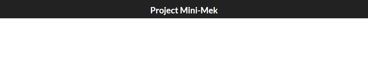
Yay - a black bar with some white text! Isn't this exciting? :) Don't worry, we'll start adding a lot more from here.
Initial UI Layout 🔗︎
Let's review the original mockup for Project Mini-Mek's UI:
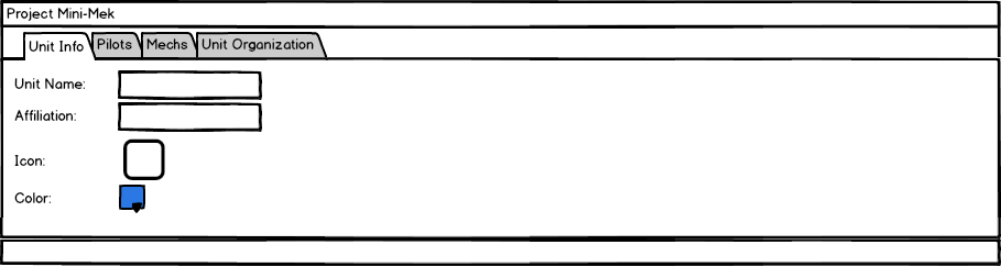
The main part of our layout is a tab bar with tabs for the four main panels. Semantic-UI's <Menu> component can be configured to display in a tabbed form, so we can go ahead and render an initial hardcoded version of our tabs:
import {
    Header,
+   Container,
+   Menu,
} from "semantic-ui-react";


class App extends Component {
    render() {
        return (
            <div className="App">
                <div className="App-header">
                    <Header inverted as="h1">Project Mini-Mek</Header>
                </div>
+               <Container>
+                   <Menu tabular size="massive">
+                       <Menu.Item name="unitInfo" active={true}>Unit Info</Menu.Item>
+                       <Menu.Item name="pilots" active={false}>Pilots</Menu.Item>
+                       <Menu.Item name="mechs" active={false}>Mechs</Menu.Item>
+                       <Menu.Item name="unitOrganization" active={false}>Unit Organization</Menu.Item>
+                   </Menu>
+               </Container>
            </div>
        );
    }
}
That gives us the following result:
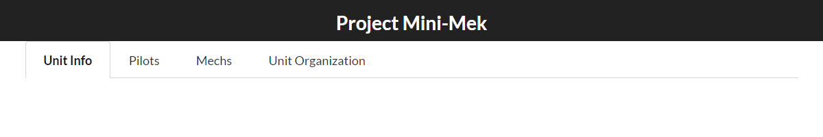
Still not very exciting, but now we can start filling this out.
Building a TabBar Component 🔗︎
We're going to need to track which tab is active, change that on click, and re-render the tab list. We also will eventually need to swap which content panel is visible as well. I added a <TabBar> component that takes an array of tab names and labels and renders the tabs. Now, we could have the <TabBar> store the value of which tab is currently selected, but it's a good practice in React to write "container components" which store the state, and keep other components that are "presentational" and just display things based on the props they're given. So, we'll create a <TabBarContainer> component to track which tab is currently selected:
Commit c5600b7: Create a TabBar component to render a list of tabs
import React from "react";
import {Menu} from "semantic-ui-react";

const Tab = ({name, label, onClick, active}) => (
    <Menu.Item
        name={name}
        content={label}
        active={active}
        onClick={() => onClick(name)}
    />
);

export default Tab;
import React from "react";
import {Menu} from "semantic-ui-react";

import Tab from "./Tab";

const TabBar = (props) => {
    const {tabs, currentTab, onTabClick, ...otherProps} = props;

    const tabItems = tabs.map(tabInfo => {
        const {name, label} = tabInfo;

        return (
            <Tab
                key={name}
                name={name}
                label={label}
                active={currentTab === name}
                onClick={onTabClick}
            />
        );
    });

    return (
        <div>
            <Menu tabular attached="top" {...otherProps}>
                {tabItems}
            </Menu>
        </div>
    )
}

export default TabBar;
features/tabs/TabBarContainer.jsx
import React, {Component} from "react";

import TabBar from "./TabBar";

export default class TabBarContainer extends Component {
    constructor(props) {
        super(props);

        const {tabs = [{name : null}]} = props;

        const firstTab = tabs[0];

        this.state = {
            currentTab : firstTab.name
        } ;
    }

    onTabClick = (name) => {
        this.setState({currentTab : name});
    }

    render() {
        const {tabs, ...otherProps} = this.props;
        const {currentTab} = this.state;

        return (
            <TabBar
                {...otherProps}
                currentTab={currentTab}
                onTabClick={this.onTabClick}
                tabs={tabs}
            />
        )
    }
}
With that in place, we can then use it to render our main set of tabs:
Commit 47154d0: Render the list of tabs using TabBarContainer
class App extends Component {
    render() {
        const tabs = [
            {name : "unitInfo", label : "Unit Info"},
            {name : "pilots", label : "Pilots"},
            {name : "mechs", label : "Mechs"},
            {name : "unitOrganization", label : "Unit Organization"}
        ];

        return (
            <div className="App">
                <div className="App-header">
                    <Header inverted as="h1">Project Mini-Mek</Header>
                </div>
                <Container>
                    <TabBarContainer tabs={tabs} size="massive" />
                </Container>
            </div>
        );
    }
}
No major visual changes from this, but we can now click on each tab and see the "active" tab get highlighted.
Rendering Tab Panels 🔗︎
Right now the tab bar only shows the tabs themselves, but no content. We really need to show a different component as the content for each tab, and swap which component is visible as the active tab changes.
One way to do this would be to actually change which component is being rendered for the content panel each time the currentTab prop changes. Another would be to always render all the tabs, but toggle the visibility instead of un-rendering them. We're going to go with toggling visibility, just because I feel like it.
It's not too hard to write the logic for toggling the display style on a given component, but I don't feel like writing that myself at the moment. There's a nice little utility component I've found called React-Toggle-Display that just renders a span with your content, and toggles the visibility of the span based on a condition or flag prop.
After adding that to the project, we need to update TabBar to look for components in the tab definitions, and render those wrapped in a <ToggleDisplay>. We also need to add some initial dummy components to our existing tab definitions:
Commit 21393ed: Add ability to swap visible tab component based on active tab
import {Menu} from "semantic-ui-react";
+import ToggleDisplay from 'react-toggle-display';


const TabBar = (props) => {
    const {tabs, currentTab, onTabClick, ...otherProps} = props;

    const tabItems = tabs.map(tabInfo => { /*.....*/ });

+   const tabPanels = tabs.map(tabInfo => {
+       const {name, component : TabComponent} = tabInfo;

+       return (
+           <ToggleDisplay show={name === currentTab} key={name}>
+               <TabComponent />
+           </ToggleDisplay>
+       )
+   });

    return (
        <div>
            <Menu tabular attached="top" {...otherProps}>
                {tabItems}
            </Menu>
+
+            {tabPanels}
        </div>
    );
}
+const UnitInfo = () => <div>Unit Info content</div>;

+const Pilots = () => <div>Pilots content</div>;

+const Mechs = () => <div>Mechs content</div>;

+const UnitOrganization = () => <div>Unit Organization content</div>;

 class App extends Component {
     render() {
         const tabs = [
+           {name : "unitInfo", label : "Unit Info", component : UnitInfo,},
+           {name : "pilots", label : "Pilots", component : Pilots,},
+           {name : "mechs", label : "Mechs", component : Mechs,},
+           {name : "unitOrganization", label : "Unit Organization", component : UnitOrganization}
         ];

         // ....
     }
}
Now, as we click between tabs, we can see the visible panel change:
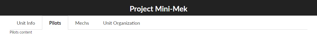
Now that we've got the tabs working, it's about time to start filling out the content for those tabs, and that means new components and new files. But, we're going to take a detour first. Creating new files means deciding where to put where to put them, and that's a topic in and of itself.
Thoughts on Folder Structure 🔗︎
There's been lots of discussion over what constitutes a good folder structure for a Redux application. The typical approaches generally fall into two categories: "file-type-first" (folders like /reducers, /components, etc), and "feature-first", also sometimes referred to as "pods" or "domain-based" (folders that each have all the file types for a given feature).
The original Redux examples use a "file-type-first" approach, but a lot of the recent articles and discussion have shown some convergence on the "feature-first" approach. There's tradeoffs either way - "file-type-first" makes it really easy to do something like pulling together all the reducers, but the code for a given feature can be scattered around, and vice versa for "feature-first".
My own current approach is mostly a "feature-first"-style approach. It's got some similarities to the approach described by Max Stoiber in his article How to Scale React Applications. The main differences are:
- I prefer to give my files full unique names, rather than having files named "actions.js" and "reducer.js" in every folder. This is mostly for ease of finding files and reading file names in editor tabs. I also would rather give component files unique names, rather than naming them
SomeComponent/index.js. - I've been using
index.jsfiles to re-export functions and components upwards as a sort of "public API" for nested folders. - I put these folders grouped under a folder named
features, rather thancontainers - I personally tend to use thunks pretty heavily, only using sagas for some specific chunks of async logic.
- I also prefer to use "absolute imports", such as
from "features/someFeature/SomeComponent", rather than multi-level relative imports.
All that said, I'm honestly not 100% happy with my current approach. In particular, in a larger app I've noticed that the time needed to hot-reload changes has gone up considerably, and I'm not sure how much is due to just having more code, and how much is due to a more entangled dependency tree causing more files to be affected. The proliferation of index.js files and re-exports is also annoying. So, I'll freely admit that I'm still trying to figure things out myself.
So, with those caveats, we're at a point where we should start extracting files to a more maintainable structure, but there's a couple tweaks we have to make first.
Enabling Absolute Imports 🔗︎
As I mentioned, I prefer to consistently use import paths that start from the src folder. Among other things, that makes it easier to move files around, as compared to relative import paths.
Normally, I'd enable that by changing some path resolution options in my Webpack config, but since Create-React-App keeps all the configuration hidden, that's not an option unless we eject the project. I did some digging around, and it turns out that, at least for now, there's a semi-undocumented way to enable this in a CRA app without having to eject. If the NODE_PATH environment variable is set, CRA/Webpack will use that in the resolution process. Also, if a .env file exists in the project root, those environment variables will be loaded up. So, we can enable absolute imports by putting those two together. However, the default .gitignore file generated by CRA ignores .env, so we'll need to fix that:
Commit 922292f: Enable absolute import paths (such as "features/a/SomeComponent")
NODE_PATH=src
-.env
With that, we can extract the dummy tab panel components into separate feature folders, and import them into App.js:
Commit 07a9c68: Extract tab panels into separate feature folders
import TabBarContainer from "./components/TabBar";
+import UnitInfo from "features/unitInfo/UnitInfo";
+import Pilots from "features/pilots/Pilots";
+import Mechs from "features/mechs/Mechs";
+import UnitOrganization from "features/unitOrganization/UnitOrganization";

import './App.css';

-const UnitInfo = () => <div>Unit Info content</div>;
-const Pilots = () => <div>Pilots content</div>;
-const Mechs = () => <div>Mechs content</div>;
-const UnitOrganization = () => <div>Unit Organization content</div>;
Building The First Content Components 🔗︎
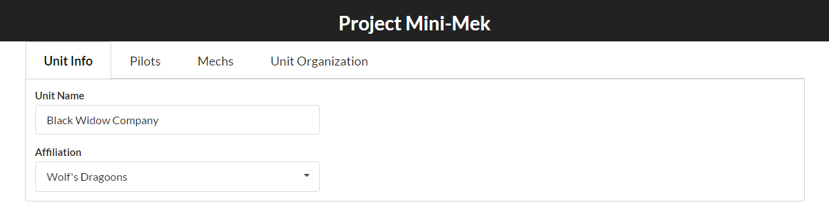
Unit Info Tab 🔗︎
The first major piece of our UI will allow displaying and editing the details for whatever fictional Battletech combat group we've created. That includes things like what the name of the group is, what faction they work for, and so on.
Per the mockup shown earlier, the Unit Info tab is just a basic form with a few fields. We'll just add the "Name" and "Affiliation" fields for now, and deal with the other fields another time.
Filling out the <UnitInfo> component is pretty straightforward:
features/unitInfo/UnitInfo/UnitInfo.jsx
import React from "react";
import {
    Form,
    Dropdown,
    Segment
} from "semantic-ui-react";

const FACTIONS = [
    // skip other entries
    {value : "lc", text : "Lyran Commonwealth"},
    {value : "wd", text : "Wolf's Dragoons"},
];

const UnitInfo = () => {

    return (
        <Segment attached="bottom">
            <Form size="large">
                <Form.Field name="name" width={6} >
                    <label>Unit Name</label>
                    <input placeholder="Name" value="Black Widow Company"/>
                </Form.Field>
                <Form.Field name="affiliation" width={6}>
                    <label>Affiliation</label>
                    <Dropdown
                       selection
                       options={FACTIONS}
                       value="wd"
                    />
                </Form.Field>
            </Form>
        </Segment>
    );
}

export default UnitInfo;
And now we finally have something slightly more visible to show off:
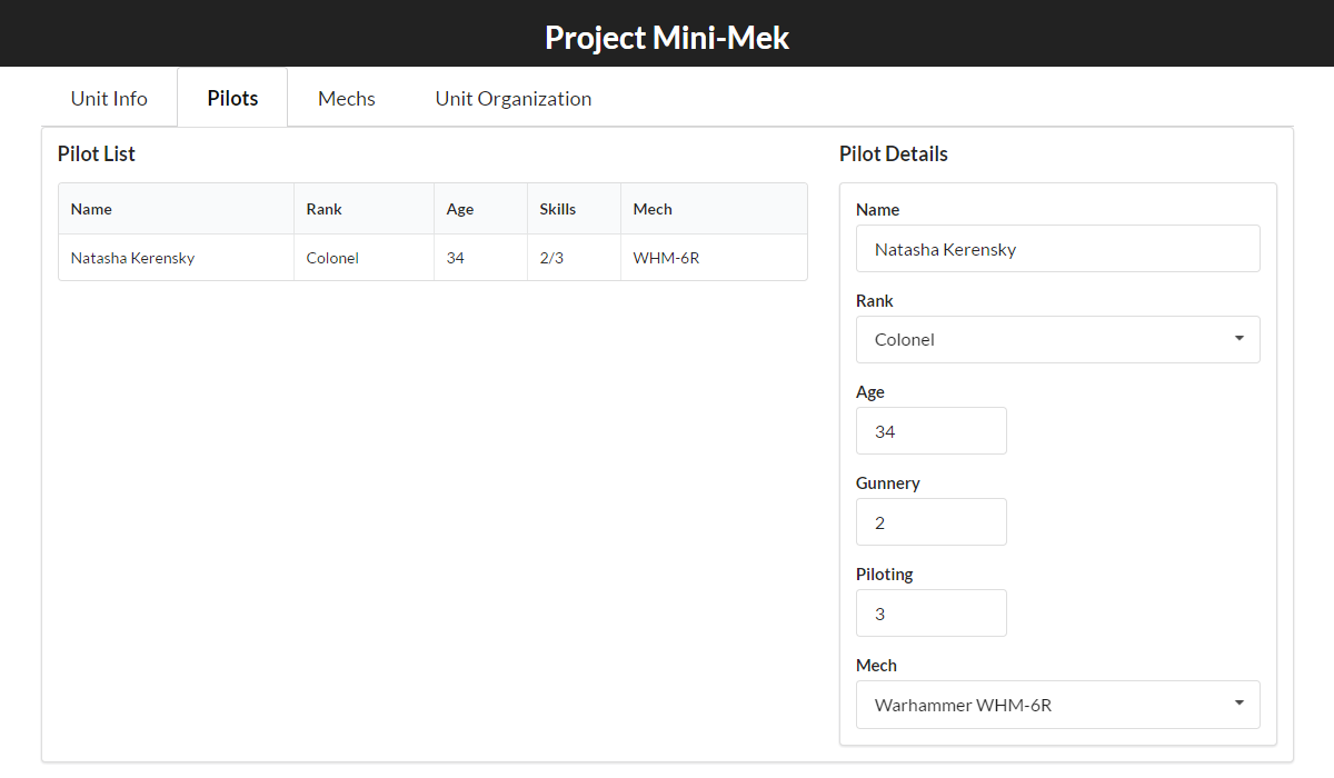
Pilots Tab 🔗︎
The second major part of the UI is a list of all the pilots that are part of our unit, and a section that will let us view and edit the details of the currently selected pilot. I'll skip pasting in the entire Pilots tab component to save space, but here's the commit and the resulting UI:
Commit 4f871f1: Add initial Pilots tab layout with hardcoded content
Handling Tab State with Redux 🔗︎
While working on the Pilots tab, a problem becomes noticeable: because the "current tab" value is stored as state in the <TabBarContainer> component, reloading the component tree resets the selected tab when the component instance gets wiped out. This is where Redux can help us, by moving our state outside the component tree. Fortunately, because we kept the tab state in the <TabBarContainer> component, we can replace the local component state version with one that pulls the value from Redux instead. The feature folder will contain the standard action constants, action creators, and reducers, as well as the selector functions to encapsulate looking up this piece of state. For simplicity, we'll just look at the reducer and the new version of <TabBarContainer>:
import {createReducer} from "common/utils/reducerUtils";

import {TAB_SELECTED} from "./tabConstants";

const initialState = {
    currentTab : "unitInfo",
};

export function selectTab(state, payload) {
    return {
        currentTab : payload.tabName,
    };
}

export default createReducer(initialState, {
    [TAB_SELECTED] : selectTab,
});
features/tabs/TabBarContainer.jsx
import React, {Component} from "react";
import {connect} from "react-redux";

import TabBar from "common/components/TabBar";

import {selectCurrentTab} from "./tabSelectors";
import {selectTab} from "./tabActions";

const mapState = (state) => {
    const currentTab = selectCurrentTab(state);

    return {currentTab};
}

const actions = {onTabClick : selectTab};

export default connect(mapState, actions)(TabBar);
A couple things to note here. We're using one of the umpteen million createReducer utility functions out there, which lets you define separate reducer functions and a a lookup table instead of switch statements. We're also using the object shorthand syntax that connect supports for the mapDispatch argument, allowing you to pass in an object full of action creator functions to be bound up, instead of writing an actual mapDispatch function yourself.
Filling Out the Other Tabs 🔗︎
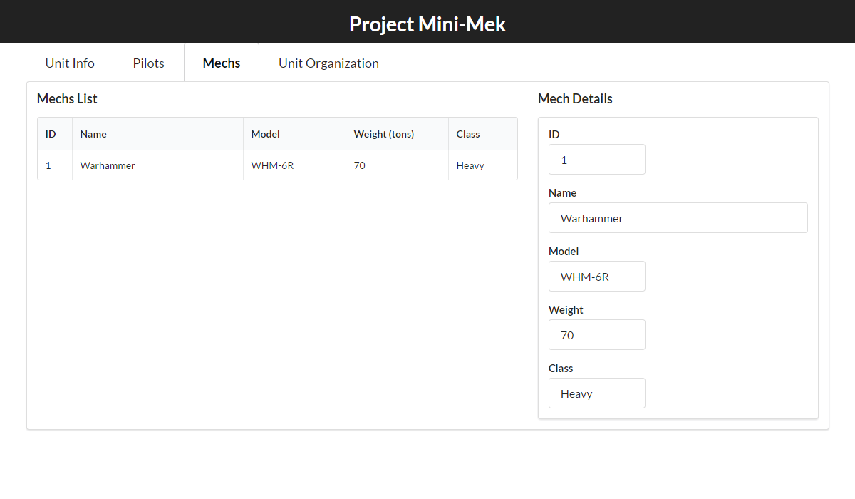
Mechs Tab 🔗︎
With the tab state persisted, we can turn our attention back to laying out the other tabs. The third major part of the UI is the Mechs tab. This will basically be identical to the Pilots tab, in that it's a list of what Battlemechs our force owns, and some form of ability to view and edit details for a selected Battlemech.
Again, the layout code is long enough that it's not worth pasting here in full, but here's what the resulting UI looks like:
Commit f8f6fc4: Add initial Mechs tab layout with hardcoded content
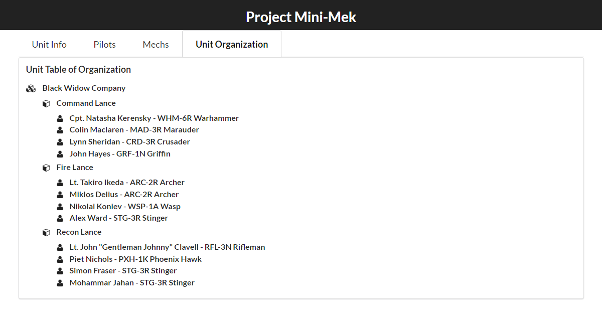
Unit Organization Tab 🔗︎
The last major part of the UI is the Unit Table of Organization tab. In Battletech fiction, Pilots and Mechs are grouped together into Lances of four Mechs apiece. Three Lances are then grouped together to form a Company. We're going to need some kind of treeview that will show the hierarchy of Company > Lance > Pilot+Mech, and eventually will need to be able to rearrange which Pilots are in which Lances. For now, we'll just hardcode a tree-like display into the UI, and leave things alone until it's time to build the real thing:
Commit e5f5258: Add initial Unit Organization tab layout with hardcoded content
Final Thoughts 🔗︎
That was a pretty good chunk of work. We've got all of our main UI laid out to match the mockups, started using a folder structure that should help the code stay maintainable as we move forward, and added some initial UI logic using Redux. From here, we can start implementing some actual functionality, and that will give us a chance to look at some specific useful Redux techniques in the process.
Next time, we'll look at some approaches for working with forms in Redux, and maybe actually get around to doing some data modeling as well.
Further Information 🔗︎
- Project Mini-Mek repo
- Semantic-UI
- React-Toggle-Display
- Container/Presentational Components
- Folder Structures
- Absolute imports in Create-React-App
- Selector Functions
This is a post in the Practical Redux series. Other posts in this series:
- Jan 01, 2018 - Practical Redux, Part 11: Nested Data and Trees
- Nov 28, 2017 - Practical Redux course now available on Educative.io!
- Jul 25, 2017 - Practical Redux, Part 10: Managing Modals and Context Menus
- Jul 11, 2017 - Practical Redux, Part 9: Upgrading Redux-ORM and Updating Dependencies
- Jan 26, 2017 - Practical Redux, Part 8: Form Draft Data Management
- Jan 12, 2017 - Practical Redux, Part 7: Form Change Handling, Data Editing, and Feature Reducers
- Jan 10, 2017 - Practical Redux, Part 6: Connected Lists, Forms, and Performance
- Dec 12, 2016 - Practical Redux, Part 5: Loading and Displaying Data
- Nov 22, 2016 - Practical Redux, Part 4: UI Layout and Project Structure
- Nov 10, 2016 - Practical Redux, Part 3: Project Planning and Setup
- Oct 31, 2016 - Practical Redux, Part 2: Redux-ORM Concepts and Techniques
- Oct 31, 2016 - Practical Redux, Part 1: Redux-ORM Basics
- Oct 31, 2016 - Practical Redux, Part 0: Introduction